This post will anayse electricity power demand across South Wales. The aim is to perform clustering on power data recordings at substations in order to see whether there are groups that have similar demand profiles and to see whether there are differences between seasons. This work was done as part of the ‘Applications of Data Science and Statisitcal Modelling’ module during my degree.
Supporting R Markdown code for this post can be found here.
Data
There are two types of data: (i) variable - the measurements from the monitors; and (ii) fixed - characteristics of the substations, that include information that may be useful when trying to understand, and name, the clusters. There are 5 datasets containing the variable data, each relating to a different season
- Summer_2012.RData
- HighSummer_2012.RData
- Autumn_2012.RData
- Winter_2012.RData
- Spring_2013.RData
The fixed data is in the Characteristics.csv file. This data set contains the following information:
- SUBSTATION_NUMBER - so you can link with the measured data
- TRANSFORMER_TYPE - ground or pole mounted (indicating urban or rural areas)
- TOTAL_CUSTOMERS - the number of customers receiving their electricity from this substation
- Transformer_RATING - indicating the size of the total power being delivered by the substation
- Percentage_IC - the percentage of industrial and commerical (not domestic) customers
- LV_FEEDER_COUNT - the number of feeders coming from the substation
- GRID_REFERENCE - the Ordnance Survey grid reference for the location
Initial data analysis tasks
1) Summarise the data in the Characteristics.csv dataset, and plot the distributions for the percentage of industrial and commercial customers, transformer ratings and pole or ground monitored substations.
# Load the 'Charecteristics' data
Char <-read.csv('data/Characteristics (1).csv', stringsAsFactors = FALSE)
# Change transformer type to factor
Char$TRANSFORMER_TYPE <- as.factor(Char$TRANSFORMER_TYPE)
# Change transformer rating to factor
Char$Transformer_RATING <- as.factor(Char$Transformer_RATING)

# Summary table
pander(summary(Char))
| SUBSTATION_NUMBER | TRANSFORMER_TYPE | TOTAL_CUSTOMERS |
|---|---|---|
| Min. :511016 | Grd Mtd Dist. Substation :706 | Min. : 0.0 |
| 1st Qu.:521516 | Pole Mtd Dist. Substation:242 | 1st Qu.: 3.0 |
| Median :532653 | NA | Median : 67.5 |
| Mean :534344 | NA | Mean :104.3 |
| 3rd Qu.:552386 | NA | 3rd Qu.:179.2 |
| Max. :564512 | NA | Max. :569.0 |
| NA | NA | NA |
| Transformer_RATING | Percentage_IC | LV_FEEDER_COUNT | GRID_REFERENCE |
|---|---|---|---|
| 500 :262 | Min. :0.00000 | Min. : 0.000 | Length:948 |
| 300 :130 | 1st Qu.:0.01048 | 1st Qu.: 1.000 | Class :character |
| 315 :105 | Median :0.17849 | Median : 3.000 | Mode :character |
| 800 : 84 | Mean :0.37982 | Mean : 2.762 | NA |
| 1000 : 75 | 3rd Qu.:0.90271 | 3rd Qu.: 4.000 | NA |
| 16 : 72 | Max. :1.00000 | Max. :16.000 | NA |
| (Other):220 | NA | NA | NA |
# Plot for Transformer type
ggplot(Char, aes(x=TRANSFORMER_TYPE, fill=TRANSFORMER_TYPE))+
  geom_bar(stat='count')+
  labs(title='Transformer type distribution',x='Transformer type')+
  theme(legend.position='none')
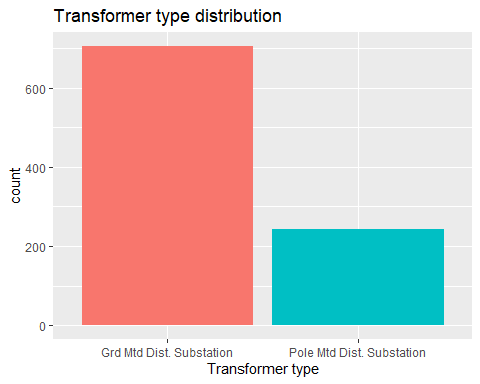
# Proportion table
pander(prop.table(table(Char$TRANSFORMER_TYPE)))
| Grd Mtd Dist. Substation | Pole Mtd Dist. Substation |
|---|---|
| 0.7447 | 0.2553 |
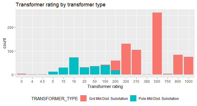
# Plot for Transformer rating
ggplot(Char,aes(x=Transformer_RATING, fill=TRANSFORMER_TYPE))+
  geom_bar(stat='count')+
  labs(title='Transformer rating by transformer type',x='Transformer rating')+
  theme(legend.position='bottom')
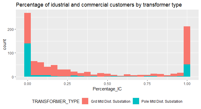
# Plot for Percentage of industrial and commercial customers
ggplot(Char, aes(x=Percentage_IC, fill=TRANSFORMER_TYPE))+
  geom_histogram(bins=25)+
  labs(title='Percentage of idustrial and commercial customers by transformer type')+
  theme(legend.position='bottom')
2) Using this and other analyses, describe the relationships between the different substation characteristics (transformer type, number of customers, rating, percentage of I&C customers and number of feeders).
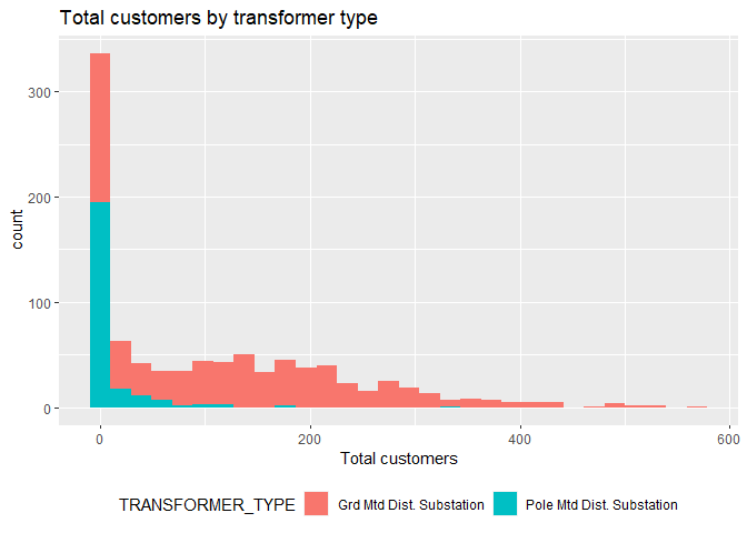
ggplot(Char, aes(x=TOTAL_CUSTOMERS, fill=TRANSFORMER_TYPE))+
  geom_histogram(bins=30)+
  labs(title='Total customers by transformer type',
       x='Total customers')+
  theme(legend.position='bottom')
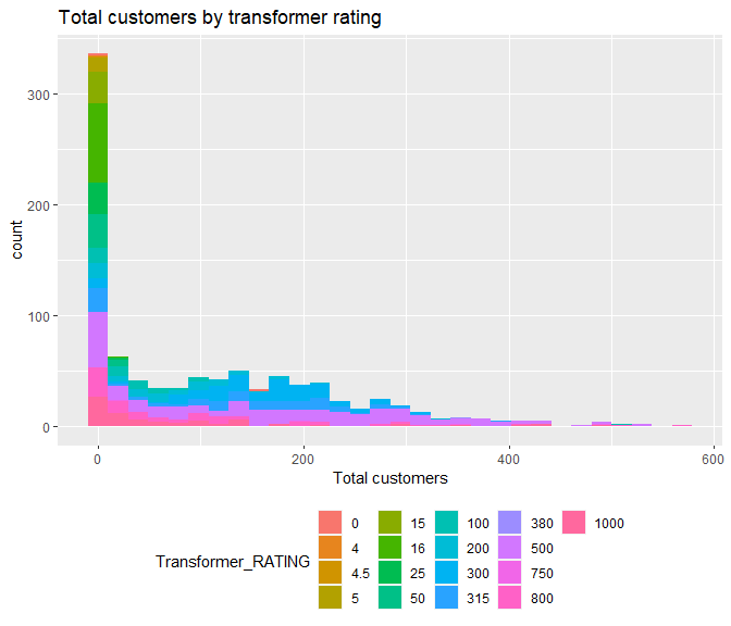
ggplot(Char, aes(x=TOTAL_CUSTOMERS, fill=Transformer_RATING))+
  geom_histogram(bins=30)+
  labs(title='Total customers by transformer rating',
       x='Total customers')+
  theme(legend.position='bottom')
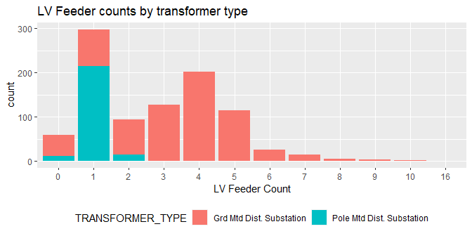
ggplot(Char, aes(x=as.factor(LV_FEEDER_COUNT), fill=TRANSFORMER_TYPE))+
  geom_bar(stat='count')+
  labs(title='LV Feeder counts by transformer type',
       x='LV Feeder Count')+
  theme(legend.position='bottom')
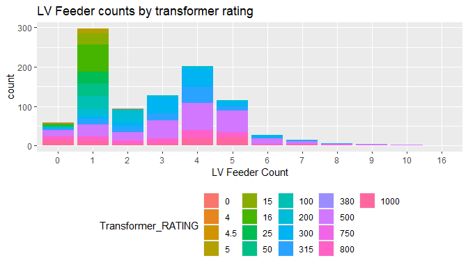
ggplot(Char, aes(x=as.factor(LV_FEEDER_COUNT), fill=Transformer_RATING))+
  geom_bar(stat='count')+
  labs(title='LV Feeder counts by transformer rating',x='LV Feeder Count')+
  theme(legend.position='bottom')
Transformer Type
- Predominantly ‘Grid Mounted’ Station which make up ~75% and ~25% ‘Pole Mounted’
- Grid Mounted stations have higher rating transformer types compared to Pole Mounted
- The distribution of industrial and commercial customers for transformer type indicated that there are either a very low number of non-domestic customers using ‘Pole mounted’ or a very high number, and very limited numbers in between.
- There are more customers that receive their power from ‘Grid mounted’ stations.
- Most Stations with Low Voltage Feeder equal to 1, are ‘Pole mounted’ stations.
Number of Customers
- There is a significant amount of stations that do not serve ‘domestic’ customers or serve a significantly low number of customers.
- Stations that serve very low number of customers or none are predominantly rated lower (4-50) than those that serve many customers.
Transformer Rating
- Most popular rating is ‘500’ serving all groups of ‘total customers’.
- Very low count for transformer ratings 4, 4.5, 380 and 750.
Percentage of I&C
- Percentage of I&C users is concentrated at both extremes, near 0 and 1, where there are over 250 stations that indicate there is no I&C customers at all, and at the other extreme that there are over 200 stations that are fully I&C customers.
Number of Feeders
- Most stations (about 300) have 1 Low Voltage Feeder, followed by 4 Low Voltage feeders as the next most common configuration.
- Stations with 1 Low Voltage Feeder have more stations with low transformer ratings (5-315), and stations with higher number of feeders have a higher transformer rating.
Initial clustering tasks
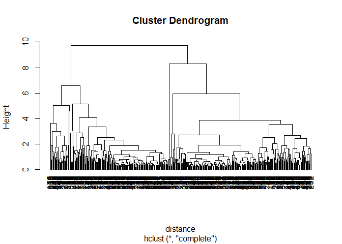
Using the scaled daily measurements from the Autumn dataset perform hierarchical clustering for the daily average demand:
3) Using your preferred choice of a dissimilarity function, create a distance matrix for these data and produce a dendrogram.
# Load in data
get(load("data/Autumn_2012.RData"))

# Select subset with scaled measurments
Autumn <- Autumn_2012[,1:146]
# Transform Date fromat
Autumn$Date <- dates(Autumn_2012[,2],
                     origin = c(month = 1,day = 1,year = 1970))

# Calculate means for every minute interval grouped by Station
Aut_sample <- Autumn %>%
              select(-c(Date)) %>%
              group_by(Station) %>%
              summarise_all(funs(mean))

set.seed(1234)
# Calculate distance matrix for 144 scaled time intervals
distance <- dist(as.matrix(Aut_sample[,-1]))

# Perform hierarchical clustering
cluster <-hclust(distance)
# Plot the dendogram
plot(cluster,hang=-1)
4) Choose an appropriate number of clusters and label each substation according to its cluster membership.
# Cut dendogram for 7 clusters
clusters <- cutree(cluster,7)

# Attach cluster membership to each Station
result <- cbind(Aut_sample, Class=factor(unname(clusters))) %>% select(Station,Class)
head(result)

  Station Class
1  511029     1
2  511030     2
3  511033     2
4  511034     2
5  511035     2
6  511079     2
5) For each of your clusters, plot the daily average demand for 1) All days, 2) Weekdays, 3) Saturdays and 4) Sundays.
# Merge Autumn data set and cluster memberships for each Station
res <- merge(Autumn,result,by='Station')
# Chnage Date type
res$Date <- as.Date(res$Date)
# Create weekdays as factors
res$weekday <- as.factor(weekdays(res$Date))
##levels(res$weekday) <- check levels
# Rename levels
levels(res$weekday) <- c("Weekday","Weekday","Saturday","Sunday",
                          "Weekday", "Weekday","Weekday")

# Create data frame for all days
all_days <- res %>%
        gather(key='minute',value,-Station,-Date,-Class,-weekday) %>%
        group_by(minute,Station,Class,Date,weekday) %>%
        summarise(avg = mean(value))

## `summarise()` regrouping output by 'minute', 'Station', 'Class', 'Date' (override with `.groups` argument)

all_days$minute <- as.numeric(all_days$minute)
all_days <- all_days %>% group_by(minute,Class) %>% summarise(avg=mean(avg))

## `summarise()` regrouping output by 'minute' (override with `.groups` argument)

# Create data frame for weekdays
Weekday <- res %>% filter(weekday=='Weekday') %>%
        gather(key='minute',value,-Station,-Date,-Class,-weekday) %>%
        group_by(minute,Station,Class,Date,weekday) %>%
        summarise(avg = mean(value))

## `summarise()` regrouping output by 'minute', 'Station', 'Class', 'Date' (override with `.groups` argument)

Weekday$minute <- as.numeric(Weekday$minute)
Weekday <- Weekday %>% group_by(minute,Class) %>% summarise(avg=mean(avg))

## `summarise()` regrouping output by 'minute' (override with `.groups` argument)

# Create data frame for saturdays
Saturday <- res %>% filter(weekday=='Saturday') %>%
        gather(key='minute',value,-Station,-Date,-Class,-weekday) %>%
        group_by(minute,Station,Class,Date,weekday) %>%
        summarise(avg = mean(value))

## `summarise()` regrouping output by 'minute', 'Station', 'Class', 'Date' (override with `.groups` argument)

Saturday$minute <- as.numeric(Saturday$minute)
Saturday <- Saturday %>% group_by(minute,Class) %>% summarise(avg=mean(avg))

## `summarise()` regrouping output by 'minute' (override with `.groups` argument)

# Create data frame for sundays
Sunday <- res %>% filter(weekday=='Sunday') %>%
  gather(key='minute',value,-Station,-Date,-Class,-weekday) %>%
  group_by(minute,Station,Class,Date,weekday) %>%
  summarise(avg = mean(value))

## `summarise()` regrouping output by 'minute', 'Station', 'Class', 'Date' (override with `.groups` argument)

Sunday$minute <- as.numeric(Sunday$minute)
Sunday <- Sunday %>% group_by(minute,Class) %>% summarise(avg=mean(avg))

## `summarise()` regrouping output by 'minute' (override with `.groups` argument)

# Plot avergae daily demand facetted by cluster, for days of week
ggplot()+
  geom_line(data=all_days,aes(x=minute,y=avg,col='all days'))+
  geom_line(data=Weekday,aes(x=minute,y=avg,col='weekdays'))+
  geom_line(data=Saturday,aes(x=minute,y=avg,col='saturdays'))+
  geom_line(data=Sunday,aes(x=minute,y=avg,col='sundays'))+
  scale_x_continuous(breaks=c(1,24,48,72,96,120,144),
                     labels=c("00:00","04:00","08:00","12:00",
                              "16:00","20:00","23:50")) +
  theme(legend.title = element_blank(),
        legend.position='bottom')+
  labs(title='Scaled daily average demand by cluster for days of week',
       x='Minute interval', y='Power')+
  facet_wrap(~Class)
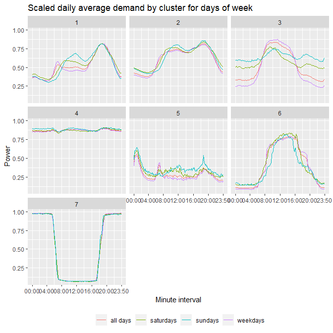
6) Describe your clusters based on the information in Characteristics.csv and choose names for them. Describe the patterns of their power demands for each cluster.
Cluster 1 – Domestic Covers mainly domestic substations, as the ‘I&C customers’ is at an average of 12%, with flat and average power demands at daytime, then peaking in the evenings, and dropping low during night hours.
Cluster 2 – Domestic and Commercial
Cluster 2 serves a mixture of domestic and commercial customers, mostly by ‘Grid mounted’ stations. During daytime the power is relatively flat, similar to Cluster 3, and then slightly peaks during evening/late hours due to domestic customers.
Cluster 3 – Commercial
Commercial dominated stations, with ‘I&C customers’ at a mean of 89%, where the demand is high and flat during day hours, and lower overnight, with the exceptions of weekends, where some commercial customers may be busier (clubs, bars).
Cluster 4 – Industrial
Very high I&C percentage – 94%, indicating an industrial profile, with a load shape that is constantly high throughout the day and night.
Cluster 5 – Economy 7
Low mean I&C customer percentage (28%), indicating a domestic profile, where power demand peaks at night hours. Such pattern can be observed by ‘Economy 7’ customers, who have lower electricity rates during night hours.
Cluster 6 – Large Commercial
Similar to cluster 3, but with much higher proportion, since the day power peak is more defined and power load is much lower at night. As well as a higher mean ‘I&C customers’ percentage of 97%.
Cluster 7– Street lighting
Power load is high and constant at night hours, and very low during day hours. These patterns can be found in substations serving motorways and street lighting.
Allocating new substations
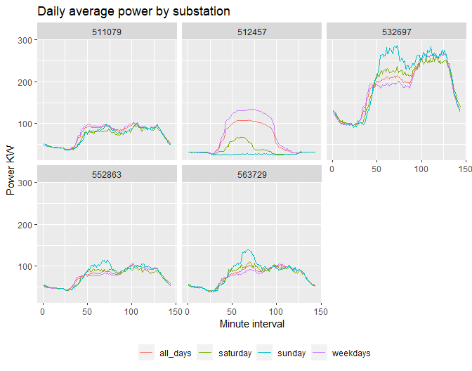
7) For each substation, on the same plot, plot the daily average demand for 1) All days, 2) Weekdays, 3) Saturdays and 4) Sundays (one plot per new substation).
New_sub <- read_csv('data/NewSubstations.csv')

Parsed with column specification:
cols(
  .default = col_double(),
  Date = col_date(format = "")
)

See spec(...) for full column specifications.

New_sub$X1 <- NULL
New_sub$weekday <- as.factor(weekdays(New_sub$Date))
levels(New_sub$weekday) <- c("Weekday","Weekday","Saturday","Sunday",
                           "Weekday", "Weekday","Weekday")

all_days <- New_sub %>%
            gather(key='minute',value,-Substation,-Date,-weekday) %>%
            group_by(minute,Substation,Date,weekday) %>%
            summarise(avg = mean(value))

`summarise()` regrouping output by 'minute', 'Substation', 'Date' (override with `.groups` argument)

all_days$minute <- as.numeric(all_days$minute)
all_days        <- all_days %>% group_by(minute,Substation) %>%
                   summarise(avg=mean(avg))

`summarise()` regrouping output by 'minute' (override with `.groups` argument)

Weekday <- New_sub %>% filter(weekday=='Weekday')%>%
            gather(key='minute',value,-Substation,-Date,-weekday) %>%
            group_by(minute,Substation,Date,weekday) %>%
            summarise(avg = mean(value))

`summarise()` regrouping output by 'minute', 'Substation', 'Date' (override with `.groups` argument)

Weekday$minute <- as.numeric(Weekday$minute)
Weekday        <- Weekday %>% group_by(minute,Substation) %>%
                  summarise(avg=mean(avg))

`summarise()` regrouping output by 'minute' (override with `.groups` argument)

Saturday <- New_sub %>% filter(weekday=='Saturday')%>%
           gather(key='minute',value,-Substation,-Date,-weekday) %>%
           group_by(minute,Substation,Date,weekday) %>%
           summarise(avg = mean(value))

`summarise()` regrouping output by 'minute', 'Substation', 'Date' (override with `.groups` argument)

Saturday$minute <- as.numeric(Saturday$minute)
Saturday        <- Saturday %>% group_by(minute,Substation) %>%
                   summarise(avg=mean(avg))

`summarise()` regrouping output by 'minute' (override with `.groups` argument)

Sunday <- New_sub %>% filter(weekday=='Sunday')%>%
            gather(key='minute',value,-Substation,-Date,-weekday) %>%
            group_by(minute,Substation,Date,weekday) %>%
            summarise(avg = mean(value))

`summarise()` regrouping output by 'minute', 'Substation', 'Date' (override with `.groups` argument)

Sunday$minute <- as.numeric(Sunday$minute)
Sunday        <- Sunday %>% group_by(minute,Substation) %>%
                summarise(avg=mean(avg))

`summarise()` regrouping output by 'minute' (override with `.groups` argument)

ggplot()+
  geom_line(data=all_days,aes(x=minute,y=avg,col='all_days'))+
  geom_line(data=Weekday,aes(x=minute,y=avg,col='weekdays'))+
  geom_line(data=Saturday,aes(x=minute,y=avg,col='saturday'))+
  geom_line(data=Sunday,aes(x=minute,y=avg,col='sunday'))+
  labs(title='Daily average power by substation',
       x='Minute interval',y='Power KW')+
  theme(legend.title = element_blank(),
        legend.position='bottom')+
  facet_wrap(~Substation)
8) Using k-means (or other version, i.e. based on medians), allocate these new substations to one of your clusters.
# Create a Daily Max column
New_sub[,'DailyMax'] <- apply(New_sub[,3:146],1,max)
# Scale the real power by dividing each value by 'Daily Max'
New_sub_s <- New_sub[3:146]/New_sub$DailyMax
# Add Substation column to scaled power inetervals
New_sub_s<- cbind(Substation=New_sub$Substation,New_sub_s)

# Summarise means for every interval by substations
New_sub_s <- New_sub_s %>%
             group_by(Substation) %>%
             summarise_all("mean")

# Create function to claculate distances of scaled values to centers of clusters
clusters <- function(x, centers) {
  # compute squared euclidean distance from each sample to each cluster center
  tmp <- sapply(seq_len(nrow(x)),
                function(i) apply(centers, 1,
                                  function(v) sum((x[i, ]-v)^2)))
  max.col(-t(tmp))  # find index of min distance
}


# Find the cluster centres for Autumn dataset
centers <- res %>% select(-c(weekday,Station,Date))
centers1 <- aggregate(. ~Class, centers, mean)

# Use function to calculate distances
cl <- clusters(New_sub_s[,-1], centers1[,-1])
# Assing cluster membership to new substations
res1 <- cbind(New_sub_s, Class=factor(unname(cl)))

# Produce table of new substations and their cluster memebership
out <- res1 %>% select(Substation,Class)
kable(out)
| Substation | Class |
|---|---|
| 511079 | 2 |
| 512457 | 3 |
| 532697 | 2 |
| 552863 | 2 |
| 563729 | 2 |
9) Based on your summaries and plots, is the cluster allocation as you expected?
Cluster allocation is as expected, substations that have been clustered into cluster 2, follow a pattern that is closer to the domestic power demand, with the difference that they have variable power magnitudes. Substation 512457 has been assigned to cluster 3, the ‘Commercial’ cluster which closely aligns with the power demand profile in this cluster, but on a smaller power scale.
Exploring differences between seasons
The aims of this section are:
- Identifying differences in power demand between seasons
- Investigating cluster groupings of substations between seasons
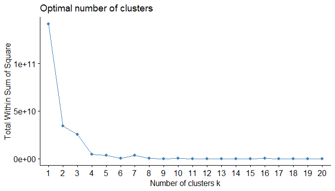
First part of the analysis will be done by performing clustering by k-means, for the Autumn data set, then attaching the cluster membership to the substation IDs. On the assumption that the cluster memberships are to be constant throughout the five seasons, the cluster memberships can be mapped onto the other seasons for the same substations. This way the clusters can be compared with seasonal patterns. To determine the number of clusters, the changes in ‘the intra-cluster variation’ can be looked at by plotting these on a graph for several clusters (in this case a maximum of 20). Where the curve indicates a ‘point of the elbow or a hockey stick’ that is where there is no additional information gain from including more clusters. Figure 1 shows a plot of ‘intra-cluster-variation’ for 20 clusters. Here it is identified to use seven clusters for the initial analysis.
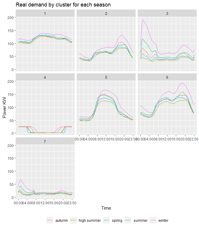
Performing k-means clustering with seven clusters on the Autumn dataset, and then assigning these clusters to substations IDs, it is then possible to assign these exact same cluster memberships to the other four seasons. Figure 2 shows the seven clusters and the scaled power demand for the five seasons. Figure 3 shows these clusters against the real power demand in KW.
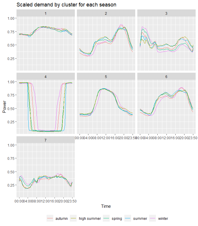
Looking at the plots the clusters can be described in the following way:
Cluster 1 – Industrial Serves predominantly industrial customers. Load shape is constantly high throughout the day and night, and the seasonal variation is hardly noticeable, except in winter the demand is slightly higher.
Cluster 2 – Domestic Mostly serves domestic customers, where the load is low and flat during daytime, and peaks during evening hours. A noticeable increase in power demand in the winter season, and a slight peak in the autumn, mostly due to rising use of heating.
Cluster 3 – Economy 7 Stations that serve domestic customers who are on an Economy 7 plan. This cluster describes a load pattern where customers benefit from a lower electricity rate during the night hours, hence the peak during 00:00-08:00. This peak increases by a great amount in wintertime, when heating is used. And then slightly less so in Springtime (possible during the transition phase of season changes, where it still might have been cold in the beginning of spring).
Cluster 4 – Street/Motorway lightin Power load is high and constant at night hours, and very low during day hours. These patterns can be found in substations serving motorways and street lighting. From the graphs it is observed that during seasons with less day light hours (winter and autumn) the power demand is at full utilisation for longer periods of time, since it is darker for longer. In summer and spring, the load profile becomes wider, and the streetlights can be on for less hours.
Cluster 5 – Commercial Commercial dominated stations, where the demand is high and flat during day hours, and lower overnight. Seasonal trends are as expected, with a slight peak in demand during winter months, and lower during summer months.
Cluster 6 – Domestic & Commercial Cluster 6 serves a mixture of domestic and commercial customers. During daytime the power is relatively flat, similar to cluster 5, and then slightly peaks during evening/late hours due to domestic customers, similar to cluster 2. Here again the anticipated seasonal changes are seen, with demand peaking during winter.
Cluster 7 – Rural Domestic
Cluster 7 looks to have stations that serve mostly a mixture of domestic
and commercial customers in rural areas, where the demand is much lower
compared to the other clusters. The load profile is relatively flat
through the day hours (commercial users) and peaks slightly around 18:00
(domestic users). There is another peak during midnight, perhaps due to
heating demands in rural reals. This peak is amplified when comparing
the non-scaled power measurements, where in winter the demand is much
higher.
In the second part of the analysis it is assumed that the cluster memberships are not constant in relation to clusters produced by the Autumn dataset. By calculating the distances of data points for the remaining four seasons to the cluster centres of the Autumn clusters, it can be seen how many stations have remained in the same cluster thorough out the seasons and how many have changed cluster memberships. Table 1 showcases the five seasons, and their respective cluster memberships in the columns. The last column ‘n’ counts how many substations have stayed throughout the cluster membership configuration in each row. For example, viewing row one, 64 stations have stayed in cluster 6 through all five seasons. Viewing row four, it is seen that 43 stations started off in cluster 2 for Autumn and Spring and later changed to cluster 6 for the reaming seasons. This is expected as cluster 2 and 6 are very similar in their domestic load profile. There are many rows below the fourth one, that have stations changing from cluster 2 to 6 and vise-versa. Overall it is observed that most stations do not change their cluster membership, hence Figure 2 with the seasonal plots can be used as a good estimate for seasonal power demand changes.
| Autumn | Winter | Spring | Summer | HSummer | n |
|---|---|---|---|---|---|
| 6 | 6 | 6 | 6 | 6 | 64 |
| 2 | 2 | 2 | 2 | 2 | 52 |
| 5 | 5 | 5 | 5 | 5 | 47 |
| 2 | 2 | 6 | 6 | 6 | 43 |
| 1 | 1 | 1 | 1 | 1 | 26 |
| 2 | 2 | 2 | 6 | 6 | 21 |
| 3 | 3 | 3 | 3 | 3 | 11 |
| 2 | 2 | 2 | 2 | 6 | 9 |
| 6 | 2 | 6 | 6 | 6 | 9 |
| 2 | 2 | 2 | 6 | 2 | 7 |
| 2 | 6 | 6 | 6 | 6 | 7 |
| 7 | 7 | 7 | 7 | 7 | 7 |
Table 2 lists cluster memberships and the count of substation in each cluster for every season. As in the previous table it is observed that stations in cluster 2 and 6 fall and rise in their counts throughout the seasons, as stations change membership between these 2 clusters due to their similar load profile. Cluster 1 has on average similar number of stations for all seasons, except high summer where a few stations (commercial) may be operating for longer hours, making their load shape similar to that of an industrial profile.
| cluster | Autumn | Winter | Spring | Summer | HSummer |
|---|---|---|---|---|---|
| 1 | 30 | 36 | 38 | 38 | 47 |
| 2 | 163 | 160 | 90 | 78 | 77 |
| 3 | 21 | 26 | 33 | 19 | 18 |
| 4 | 3 | 3 | 3 | 3 | 3 |
| 5 | 66 | 56 | 66 | 66 | 55 |
| 6 | 96 | 101 | 148 | 170 | 176 |
| 7 | 11 | 8 | 12 | 16 | 14 |
Overall, with the exception of interchanging stations between clusters 2 and 6, on average the cluster memberships are observed to be stable with changes in seasons. Performing a clustering analysis based on one of the seasons initially, and then mapping the cluster memberships of each station, to the remaining seasons, produces seasonal demand patterns, that are on average accurate to rely on. And an increase in power demand during winter months is observed in all clusters.